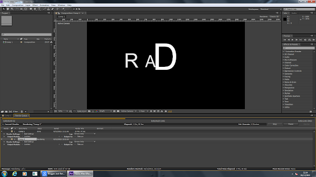
I decided to make the main title on After Effects so that it would be more memorable and professional as well as highlighting the title's importance. The animation also helps viewers understand the reasons behind why it is called 'R D O'.
 |
| This shows the title rendering into a video file. |
I didn't know how to use after effects so I decided to try and find some instructions on the internet. I came across a website called VIDEO COPILOT which gave out tutorials on how to make great titles. I chose the Fly By Titles option as I thought they were dramatic and radio-y. The website gave a video tutorial on how to do this;
The video shows pretty much what I did, only I used Arial font and a different version of the programme. I used the techniques in the video to create three different title animations. This meant I had a variety to choose from. Here they are:
The video shows pretty much what I did, only I used Arial font and a different version of the programme. I used the techniques in the video to create three different title animations. This meant I had a variety to choose from. Here they are:
I decided to edit the colour on this one so that it was like that in the video. However, i decided that this made it look too dark and overly Sci Fi (although i did want a hint of Sci Fi). I also thought that it was too quick and did not give viewers long enough to view it. I also decided that RDO on it's own did not really explain itself very well.
I created this one so that the meaning behind RDO could be understood. The font is coloured plainly white on a plain black background. This resembles the stark differences between life and death in a post apocalyptic world. The white could also represent life, hope, and humanity against these dark ages. It shows the RaDiO to be a beacon of hope for our protagonist but also as something shrouded in mystery. White and black together can both connote death and therby; survival. The fact that it flies by makes the title more dramatic and secures it as a key factor in the film. This and the formality of the font also suggests the modern/sci fi genres we see in the radio station. The plainess of the font also shows how plain human life is in the post apocalyptic world. Humans depend on basic needs and instincts and have no fancy luxuries which could be conveyed with a more fancy font.
This animation is largely the same as the last only the letters do not dissapear. This conveys how the RDO is a radio, but not as you know one. The differences in font sizes convey the quirkiness of RDO and suggest how basic elements to a 'normal' radio (symbolised by letters) are missing. These last 2 titles last rougjly 12 seconds long. This is quite slow but I would rather have to speed it up in Premier Pro than slow it down.

No comments:
Post a Comment